Ruined Rockstars Object Covers
Have you noticed the new cover trend in steamy romance? I’ve been watching it for a while, but this year in particular it’s really moving away from the shirtless guy cover and into the object/text based covers. I really love the creativity that comes along with these, and as much as I loved the ones I was seeing, it was still scared to pull the trigger on using an object cover for my own books.
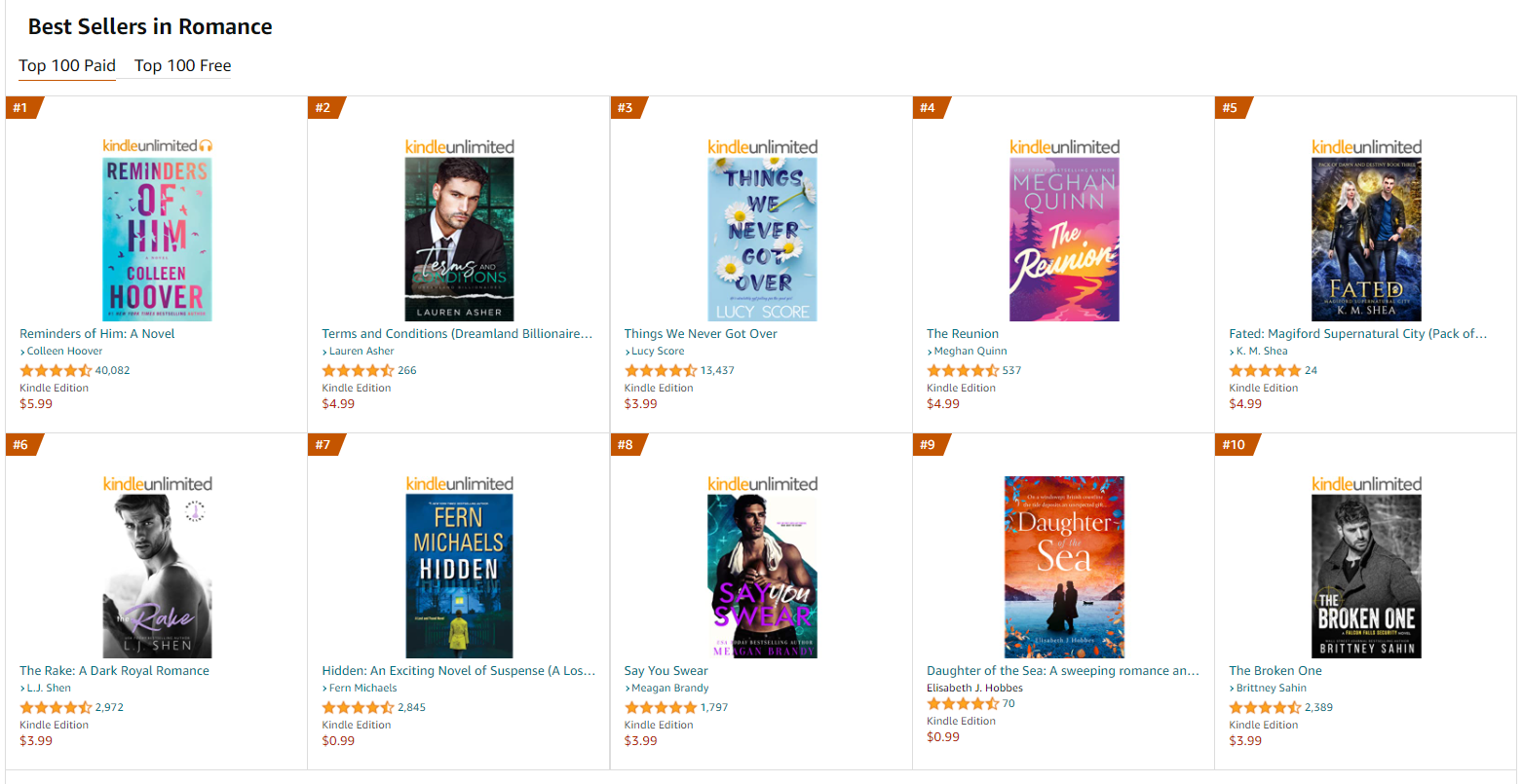
I mean, look at the top best sellers in romance at the moment:
I see a few guys, sure. That’s the classic way to go and people still like them. But do you see how many object or text-based covers there are?
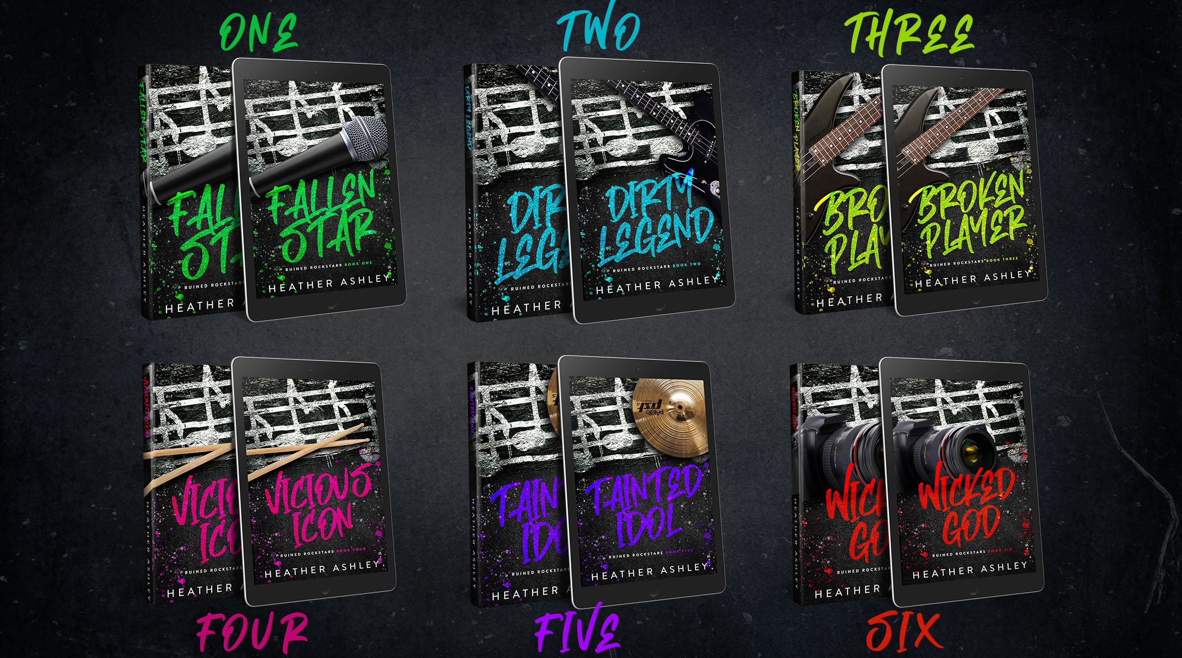
When I reached out to my designer (Dee at Black Widow Designs) I truly had no idea what I wanted. I sent a bunch of random stock photos that I thought were related to rock star stuff or had the right “feel” and hoped one of them might inspire her.
And holy crap, did it ever!
Check out the new object-based covers she came up with:
Aren’t they amazing?
I’m currently working on getting the covers switched over for Paperback (because it involves some interior formatting changes… I like to have my chapter headers match the fonts on the outside of the book so everything’s cohesive), but they should all be updated soon!
So, what do you think about this new trend? Leave a comment and let me know!


