A Beautiful Carnage Update
This book has been my first attempt at not immediately publishing something after I’ve written it. I know a lot of authors plan their release schedules months (and years) in advance, but I don’t really operate that way. Maybe someday I will, but I’m usually more fly by the seat of my pants as a writer when it comes to what I’m writing and releasing and when.
This time around, I also hired a developmental editor. I’ve always been pretty insecure about my stories and the way they play out, so I finally took the leap and hired someone to help me make sure the story was going where I wanted it to and would be satisfying for the readers (Tori over at Cruel Ink Editing, in case you were wondering).
That really helped because she pointed out some places that needed to be fleshed out, questions that needed answers (although there will still be some that carry over into the later books in the series, but that’s intentional whereas these weren’t), and places where more info was needed about a character. (And this is after I wrote a solid 10,000 words about each of the main characters before I even started because I have a compulsive need to know ALL THE THINGS about my characters before I start writing them).
Once all the revisions were made, the manuscript went off to copy and line editing and finally to the formatter. This is the first time I’ve used a professional to format my ebook and paperback and HO-LY SHITBALLS. I’m never going back to doing it myself again.
Dee from Black Widow Designs totally killed it. I mean, just LOOK:
As of now, Beautiful Carnage will release October 11, so not much longer to wait and in the meantime, I’m almost halfway through writing the sequel. You can check it out over on my Patreon.
Ruined Rockstar Object Cover Paperbacks
Last week I managed to get all the Ruined Rockstars paperback interiors updated to match their brand new object-based covers. I’m so happy with how they came out (even if it was a ton of work, totally worth it!). I have this thing where the interior fonts need to match the ones on the covers, so anytime I change a cover it’s a massive undertaking to update everything to match.
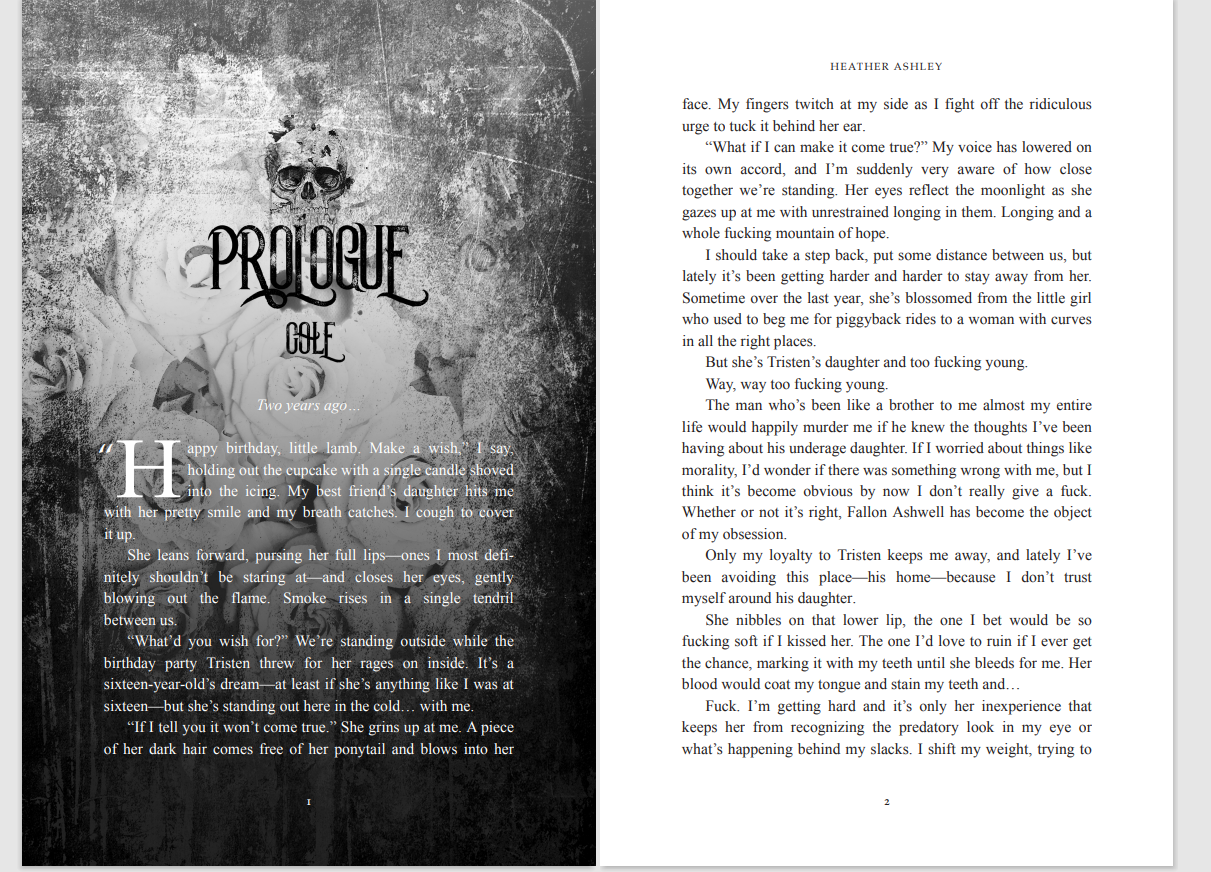
Last week I managed to get all the Ruined Rockstars paperback interiors updated to match their brand new object-based covers. I’m so happy with how they came out (even if it was a ton of work, totally worth it!). I have this thing where the interior fonts need to match the ones on the covers, so anytime I change a cover it’s a massive undertaking to update everything to match. Take a peek inside of Vicious Icon:
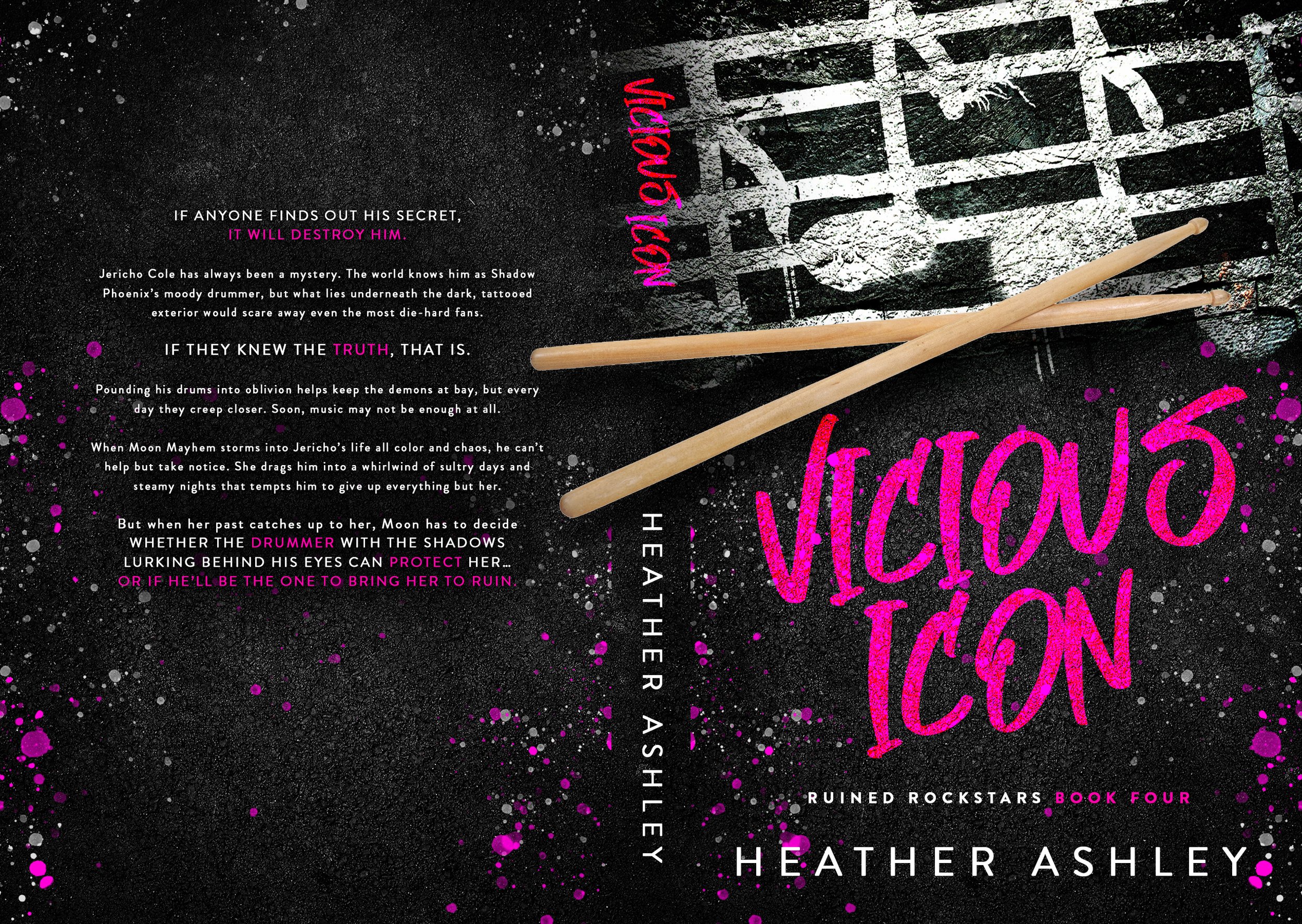
Each interior has a different picture and some other fun surprises. I’m also totally obsessed with the full cover wraps on these. Here’s Jericho’s:
The edgy feel and the way the drumsticks wrap around the spine and into the back just makes me so fucking happy every time I look at them. Dee at Black Widow Designs totally killed it with these covers.
Are you one of those people who collects paperbacks? If I started offering signed copies, would that be something you’d be interested in? Leave me a comment and let me know!
Ruined Rockstars Object Covers
Have you noticed the new cover trend in steamy romance? I’ve been watching it for a while, but this year in particular it’s really moving away from the shirtless guy cover and into the object/text based covers. I really love the creativity that comes along with these, and as much as I loved the ones I was seeing, it was still scared to pull the trigger on using an object cover for my own books.
Have you noticed the new cover trend in steamy romance? I’ve been watching it for a while, but this year in particular it’s really moving away from the shirtless guy cover and into the object/text based covers. I really love the creativity that comes along with these, and as much as I loved the ones I was seeing, it was still scared to pull the trigger on using an object cover for my own books.
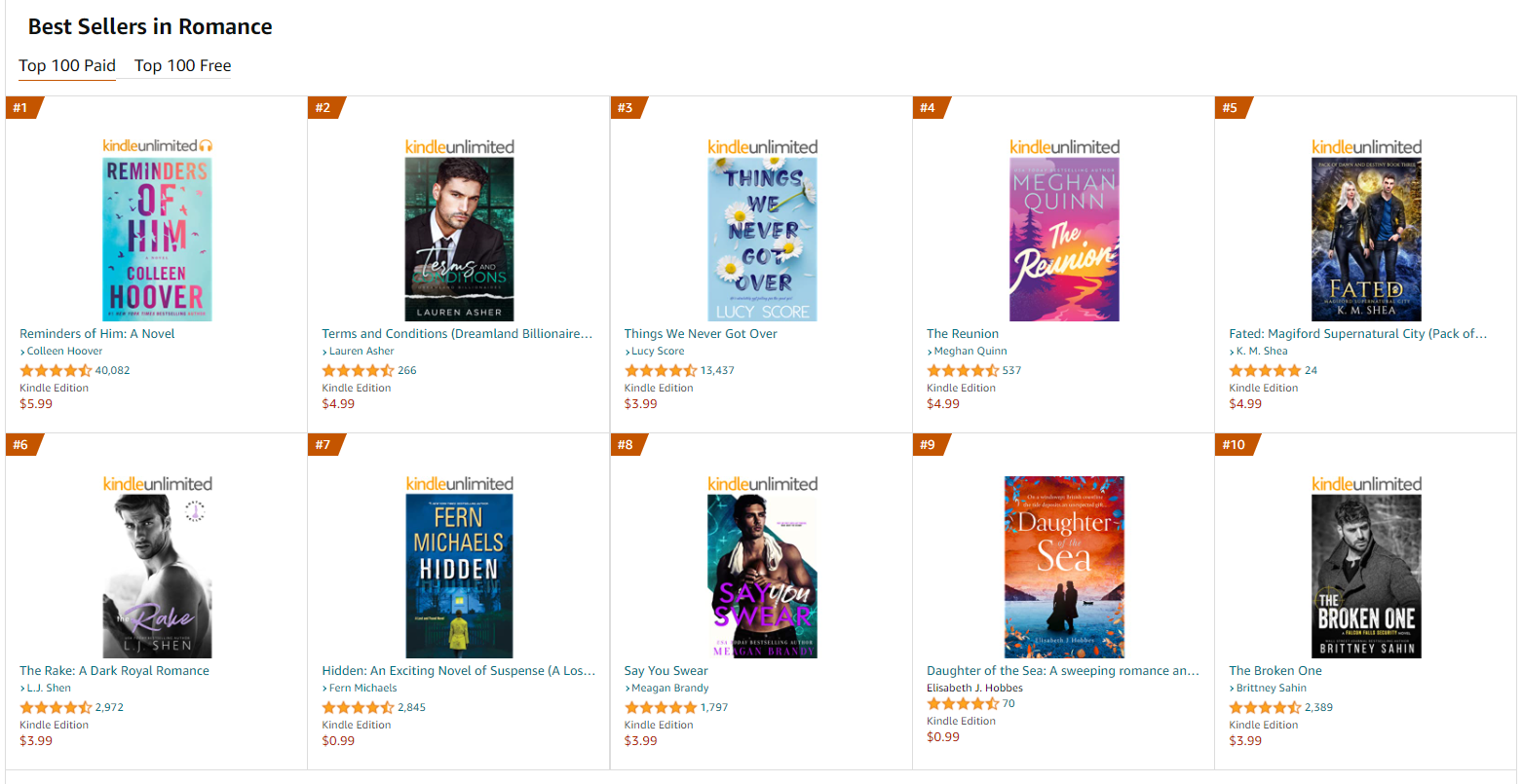
I mean, look at the top best sellers in romance at the moment:
I see a few guys, sure. That’s the classic way to go and people still like them. But do you see how many object or text-based covers there are?
When I reached out to my designer (Dee at Black Widow Designs) I truly had no idea what I wanted. I sent a bunch of random stock photos that I thought were related to rock star stuff or had the right “feel” and hoped one of them might inspire her.
And holy crap, did it ever!
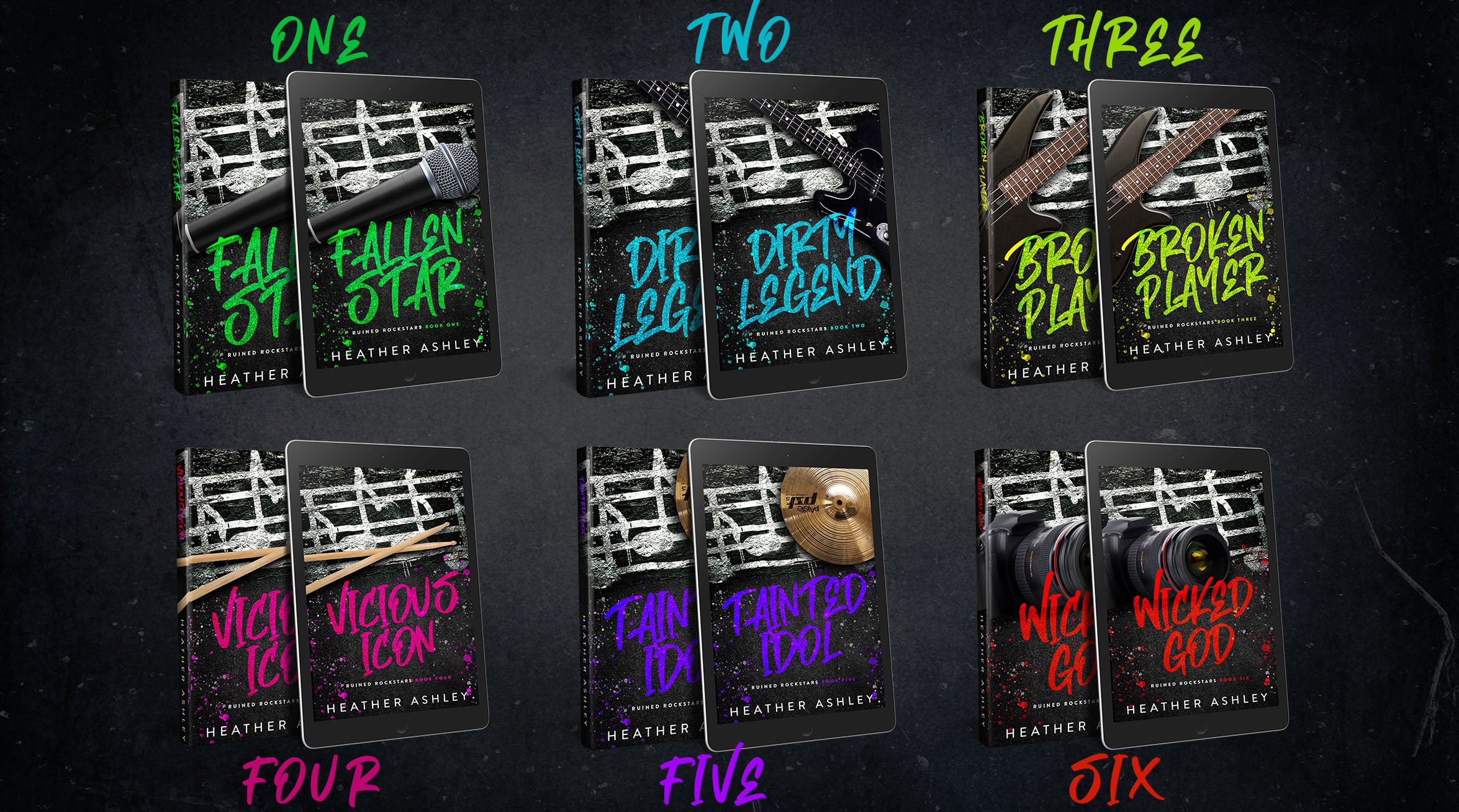
Check out the new object-based covers she came up with:
Aren’t they amazing?
I’m currently working on getting the covers switched over for Paperback (because it involves some interior formatting changes… I like to have my chapter headers match the fonts on the outside of the book so everything’s cohesive), but they should all be updated soon!
So, what do you think about this new trend? Leave a comment and let me know!
Makeover
As you may or may not know (depending on when you came across my writing), I’ve never been crazy about ANY of the versions of the Shadow Phoenix covers. None of them really screamed “ROCK STAR” at me the way I wanted, but I had no idea how to make that happen.
As you may or may not know (depending on when you came across my writing), I’ve never been crazy about ANY of the versions of the Shadow Phoenix covers. None of them really screamed “ROCK STAR” at me the way I wanted, but I had no idea how to make that happen.
Well, I need to overhaul the series for paperback now that I’ve figured out InDesign and how to make the insides pretty (I’m lookin’ at you, Captive) and since I need to put in the work to re-do the insides, I figured I might as well go balls out and just have them all re-edited (to make sure any of the stuff I missed the first time around has a whole new set of eyes on them to find things like the embarrassing way I used “symbols” when I really meant “cymbals”).
But then my husband says, “Do you think we should re-cover them, too?” and I was so not thinking about the covers, but then I looked at them and got this sort of splinter in my brain like I HAVE TO DO THIS RIGHT NOW BECAUSE THEY’RE ALL WRONG (yes, I yelled it at myself).
So… I spent an entire day re-doing the covers, and honestly they’re my favorite of all the covers so far. I liked the black background ones, but again, they just didn’t give off the vibe I wanted. This new set totally does, and I’m really happy with them. I can’t promise I won’t put new covers on them again, but considering I’m going to be going through the process of turning them all into beautifully edited and designed paperbacks, it’s not happening again for a LONG while.
Besides, I have other stuff to spend my time working on like writing Chased or Crossed Souls (and also, I have like 4 other books plotted out loosely in my mind right now, too, as part of other series’). SO, if you were wondering why the covers suddenly look different on the website or on Amazon, the reason is I needed more rock star (said in my best Christopher Walken cowbell voice).
If you haven’t seen ‘em yet, take a peek:
What do you think of the new covers? You can check them all out over on the books page. Leave me a comment and let me know which covers are your favorite.
Finding Zen: New Cover Announcement
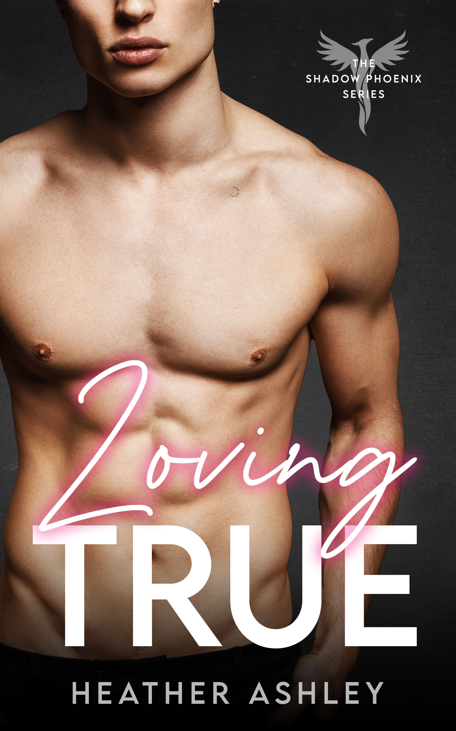
The Shadow Phoenix series was my first ever, and because of that I didn’t know what the hell I was doing. My first version of the Zen cover I did myself and… it was okay. But, I didn’t know the first thing about designing a book cover.
The Shadow Phoenix series was my first ever, and because of that I didn’t know what the hell I was doing. My first version of the Zen cover I did myself and… it was okay. But, I didn’t know the first thing about designing a book cover.
Zen’s first cover that I designed myself.
I quickly realized that your cover is your most important marketing tool and that not knowing what you’re doing wasn’t good. At all. So, I hired a designer. Sarah. She’s awesome and great to work with and I plan to use her again in the future. (Check out her portfolio here).
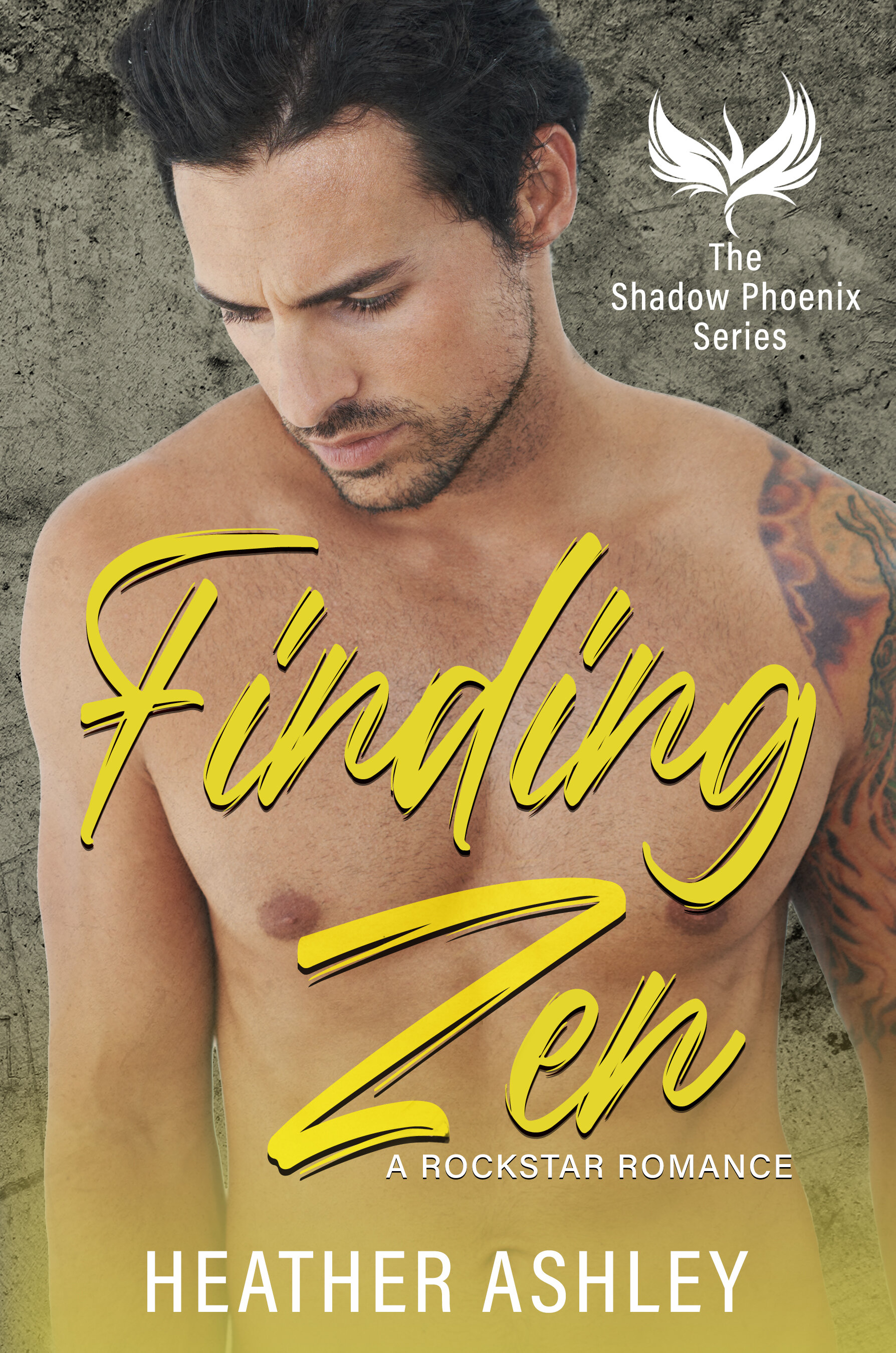
But anyway, I found Sarah in a Facebook group and loved her work, so I hired her to make me a custom cover for Zen. The problem was… I had no idea what I wanted. I didn’t give her a lot of direction and even when it didn’t come out quite like I envisioned, I wasn’t sure what to tell her to get it to where I wanted it to be. So I left it and had her do the rest of the series covers in the same design.
There was just something I didn’t love, even if I had no idea what I wanted and couldn’t put my finger on what it was.
Finding Zen’s second cover. Much more professional.
So, I started collecting covers. Anytime I would see a cover I liked, I saved it to a folder so I could get a sense of what it was I was looking for. And I started playing in Photoshop, learning new techniques. I designed a bunch of covers for fun for my friend, and fellow author, Melony Ann.
And suddenly I realized what was missing. The covers weren’t rock star-y enough. They were good, professional covers. But they didn’t give off that dark vibe I realized I wanted. So, I started messing around and spent hours in Photoshop until I had something that I liked.
Zen’s third (and final?) cover.
So, what do you think? Which cover do you prefer? Leave me a comment and let me know!


